
.
PivotCharts and PivotTables are similar in that they both allow you to manipulate how your data is presented and analyzed. PivotTables can be the foundation of PivotCharts. If you are not familiar with PivotTables, see Working with PivotTables first.
Without SoftArtisans OfficeWriter, Microsoft SQL Server Reporting Services does not support embedding a PivotChart in a report that can be exported from its Report Manager. Therefore, everytime you export your report from Reporting Services to an Excel format, you need to recreate the PivotChart. If you have many reports, keeping track of how you originally set up the PivotChart can be an intimidating task.
Using OfficeWriter Reporting Services Integration, you can put a PivotChart in your report definition once, and the PivotChart will be refreshed with new data each time the report is executedPivotCharts are a useful way to visualize data that appears in PivotTables.
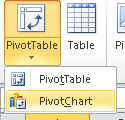
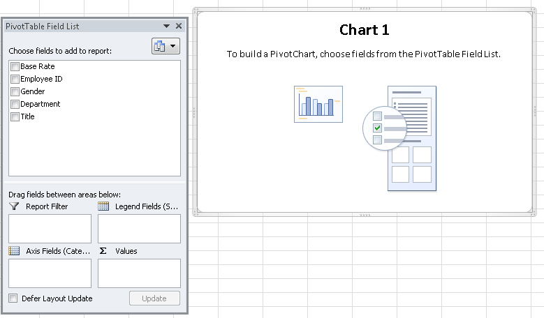
Let's take a look at how you can integrate PivotCharts into your OfficeWriter Designer reports. to add a PivotChart (and PivotTable) to a Excel report for OfficeWriter.
| Note |
|---|
This example will use the AdventureWorks sample database shipped with SQL Server Reporting Services |
...
. We assume you already know how to create a basic report in Excel using Officewriter Designer. If you don't know how to do this, first read |
...
Our sample will use a simple query to compare average salary among job titles, gender, and departments, using a chart.
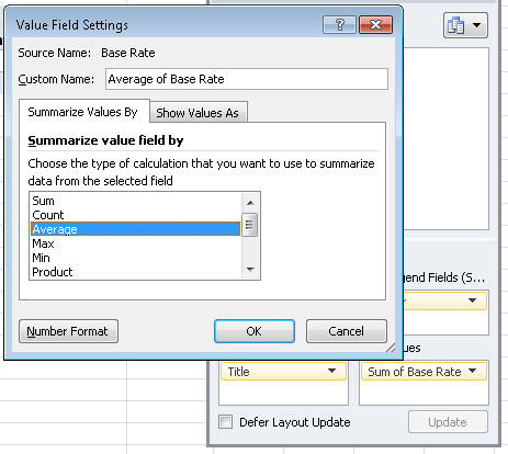
For our example, we want to see the average salary, or base rate. However, the default for the PivotChart made the base rate a count, so we must change that.
When the report is executed, the data markers that you created in Step 1 will be replaced with values from the database. To ensure that the PivotChart is constructed properly, you must replace the data markers with placeholder data - any data that will be of the same format as the real output data. For example, if the field is numeric, such as the EmployeeID field, we may use a zero or any other number. If the field is a character field, such as the Title field, we need to use a character placeholder. For our example, we will use the word 'none' for the Title and Gender fields.
| Note |
|---|
When you insert placeholder data, never use a real value. E.g. if you are displaying a city name, don't use 'Boston' for the placeholder data. The results returned for 'Boston', in that case, may not behave as expected. The same holds true for numeric data. Try to find a value that will never actually be in the query's result set. |
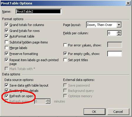
There is one more thing to do before trying our PivotChart. Right-click on the pivot table and select Table Options from the list. Near the bottom of the left column, make sure Refresh on Open is checked. If you do not check this, when the report is viewed, your PivotChart and PivotTable will be empty.
Publish, and View your report. Notice that on the first sheet, your data columns display the correct data.
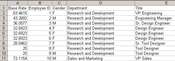
Now look at the sheet containing your PivotChartThis query returns employee pay rate and department data from the AdventureWorks database. This is the data that will be used in the report.
| Code Block | ||||
|---|---|---|---|---|
| ||||
SELECT Gender, Title, Employee.EmployeeID, Rate, Department.GroupName
FROM AdventureWorks.HumanResources.Employee,
	AdventureWorks.HumanResources.Department,
	AdventureWorks.HumanResources.EmployeeDepartmentHistory,
	AdventureWorks.HumanResources.EmployeePayHistory
WHERE Employee.EmployeeID = EmployeePayHistory.EmployeeID AND
	Employee.EmployeeID = EmployeeDepartmentHistory.EmployeeID AND
	Department.DepartmentID = EmployeeDepartmentHistory.DepartmentID
|
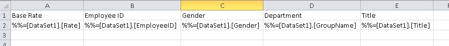
Below is a screenshot of an Excel template with data markers that will be populated with the data from the above query.
Just as we did for the PivotTable in Working with PivotTables, we will want to change the Values computation from Count to something more useful.
Right click on Count of Base Rate in the Values section in the Pivot Fields menu and switch the calculation to Average.
\
We mentioned earlier that PivotCharts are powered by underlying PivotTables. To make sure that the new data is pulled into the PivotTable (and therefore the PivotChart), the data source needs to refresh when the workbook opens.
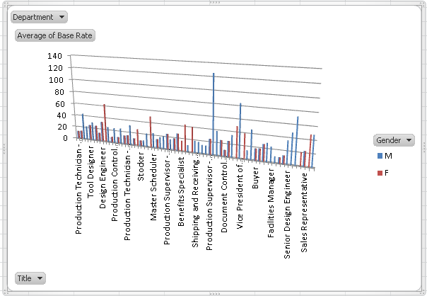
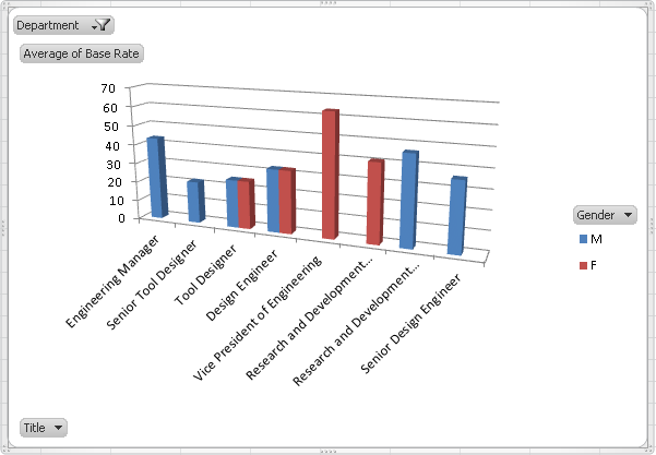
Your PivotChart is now finished and should look like this:
!final_template_chart.png!
Publish, and View your report.
| Note |
|---|
When using the OfficeWriter Designer View functionality, you may be prompted to re-deploy your report even if you have not made changes since the report was last deployed or retrieved. This is because when the report is opened or deployed, Excel considers this a workbook open event, so the PivotTable refreshes. Although there are no visible changes to the report, Excel treats the refreshed PivotTable as a change to the file. Any time Excel detects changes to the file, it will prompt you to redeploy the report before viewing in the Designer. |
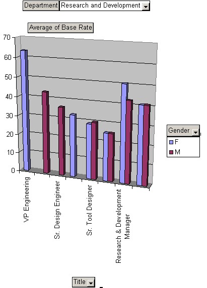
Look at the sheet containing your PivotChart and PivotTable. You should have the Titles across the bottom of the graph but it is not very pretty. It contains all the data.
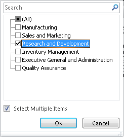
Open the drop-down list of departments and select one to filter the PivotChart display.
Now you get a clear graphical picture of the data that visually presents the wage differences between males and females by position across departments.
Now, go to the worksheet containing the chart's PivotTable. What do you see? The selections on the PivotTable match those of the chart. If you selected a department on the PivotChart, that same department was selected on the PivotTable. The PivotChart and the PivotTable work hand-in-hand.
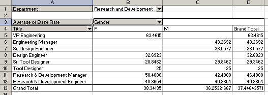
You'll also notice that the PivotTable has been filtered too. Since the PivotChart displays the data that is in the PivotTable, when you change the view in the PivotChart, the PivotTable updates accordingly as well.
...
To see the report as you designed it with OfficeWriter: